Just a few graphs on the development of the S&P500 Index from 1975 – 2014, using data from yahoo finance.
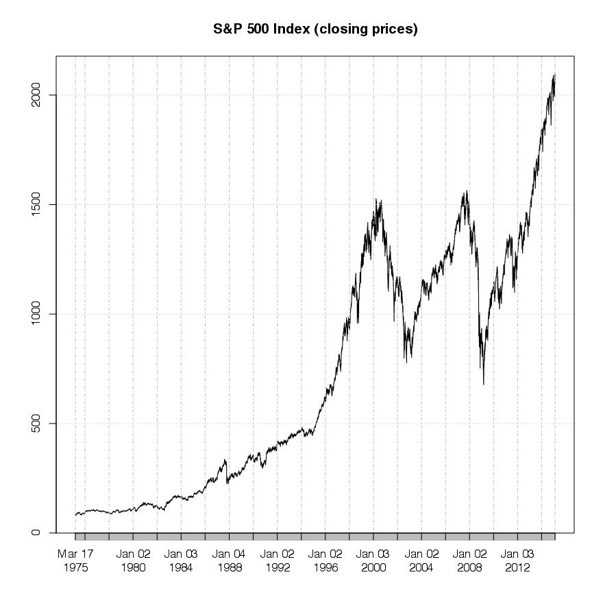
The first graph shows the price movement of the index for the time period from 1975 to 2014 (available data at yahoo finance), with slower but rather constant growth in the first half of the time period and higher growth in the second. And of course the two major set backs from 2000-2003 and 2007-2009 are clearly visible.

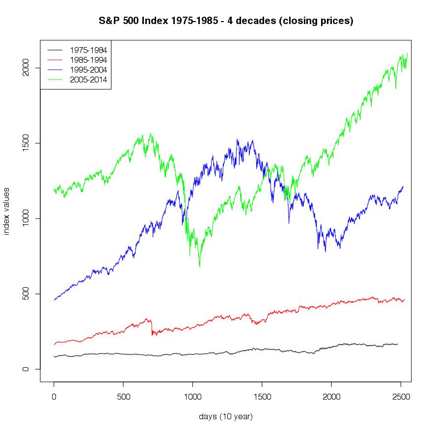
The next graph presents the same time series separated into decades, merged together into one graph. It is easy to see that there is a constant positive development within the different decades (with respect to the choice of truncation). The question arising now is, in which period did the most change in index value occur. The answer to this question kind of turns the plot on its head. It can be found in the next graph.

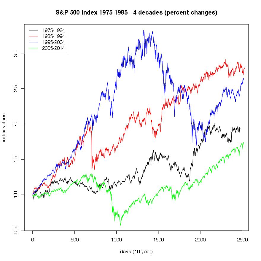
Regarding the question from above the following plot shows the same development in percent values, for the individual decades, included into one graph. Now the separation between the periods becomes more clear, with the highest movement between 1985-1995 and the lowest between 2005 and 2014.

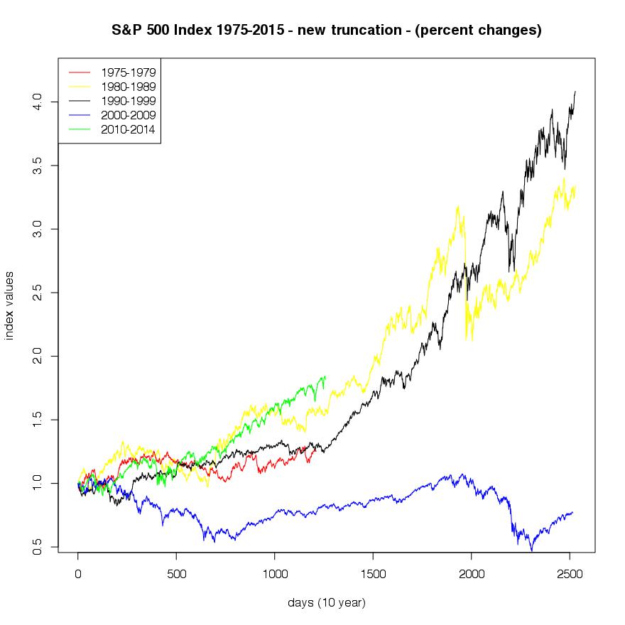
An other interesting effect appears when we modify the truncation of the single decades. E.g. if we observe the time frames from 1980-1990, 1990-2000, 2000-2010, an so on. 3 decades of the index development are strongly positive whereas 1 decade shows a negative development (2000-2010), indicating the possible importance of timing models.

- http://finance.yahoo.com/q?s=%5EGSPC